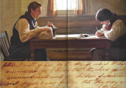
This picture was in a magazine article done by Eric Johnson. The original article can be found at https://www.mrm.org/paintings-book-of-mormon
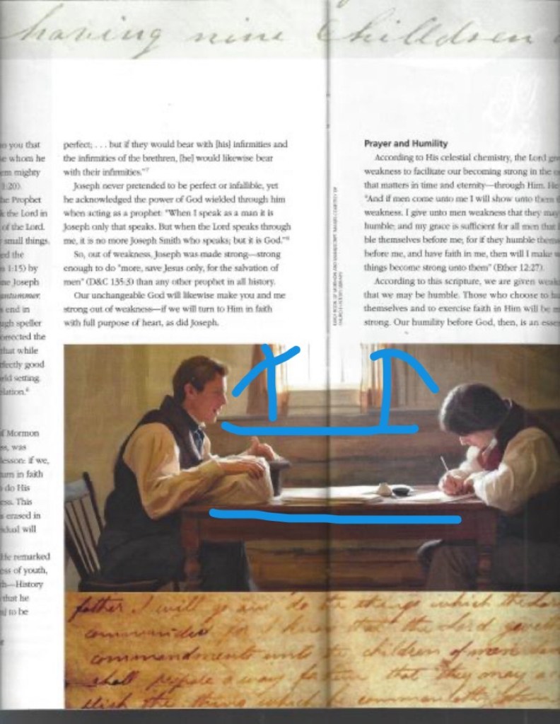
As you can see in this draw-over, the lines in the picture are leading lines. They draw our attention to the men, Joseph Smith and Oliver Cowdrey. The lighting also brings our eyes to their faces because they are lit up from the light in the window.

As you can see in this picture, I tried to point out how the fonts contrast each other. The top font is a light, cursive font. While the rest of the page is smaller type that is completely different.
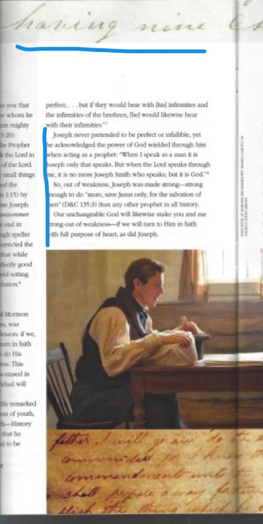
From this draw-over, I tried to point out the two types of font that are in this magazine article. The top, cursive font I would consider to be decorative because it looks fancy and done by hand. The rest of the page has regular type, and I would say it is sans-serif. You can see how the type has a little slant to it.
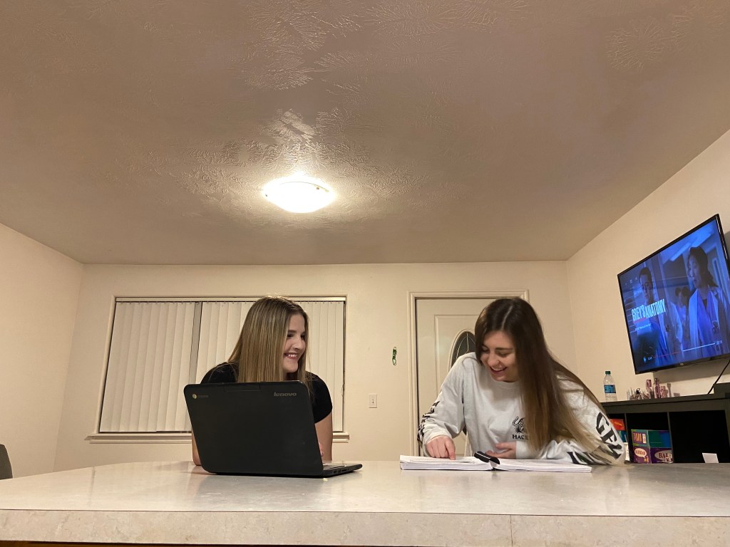
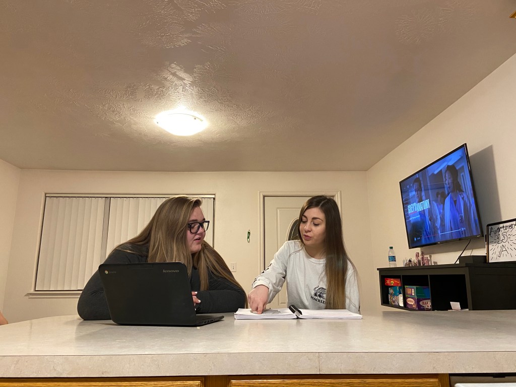
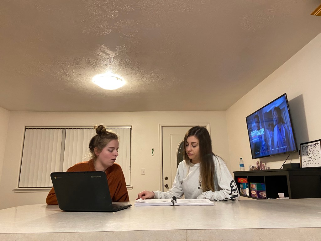
As you can see from these three pictures I took, they match the general idea of what the magazine picture is doing. The light is right above them, creating a triangle look. It makes your eyes go directly to the other points of the triangle. The table also creates a leading line, all of it draws your eyes to the girls in the pictures.
All of this is very important when it comes to design because you want the people who are looking at your work to clearly see what the point of the picture is, and they need to be able to easily read what you’ve typed. Which is why font is so important. Which font you use and where you put it makes a big difference in the overall layout of your design.
