Be yourself; Everyone else is already taken.
— Oscar Wilde.
This is the first post on my new blog. I’m just getting this new blog going, so stay tuned for more. Subscribe below to get notified when I post new updates.
Be yourself; Everyone else is already taken.
— Oscar Wilde.
This is the first post on my new blog. I’m just getting this new blog going, so stay tuned for more. Subscribe below to get notified when I post new updates.
When you think of the word legendary, what do you think of? Do you think of your personal heroes? Do you think of stories that have been passed around through the years? Do you think of people who have conquered the unconquerable?
Do you think of yourself? Do you think about how you are a legendary person? How you are a hero to others? Do you think of the stories of your life and the experiences you’ve had? Do you think about how you have accomplished things you never thought you could?
Think about it: YOU are legendary. YOU are important. YOU are amazing.
You have dreams. You have goals. You have a life that has unlimited potential. Now go out and start. Decide today to have a legendary life. Be your legendary self.
I found an ad through Nike about Lebron James stretching his arms from side to side, and he just looks up as if he has accomplished everything he ever wanted. I got an idea from that ad, and I made my own.
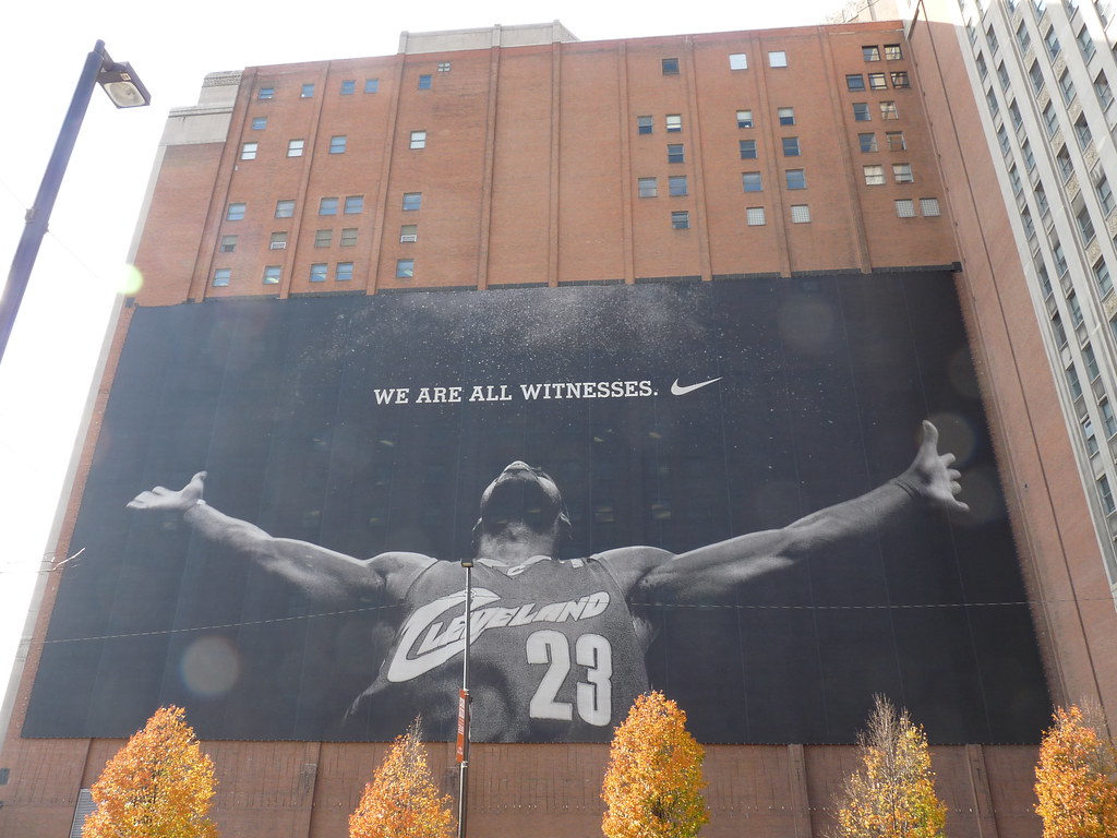
I used this picture of Lebron James for a few reasons. The first was because of the design.
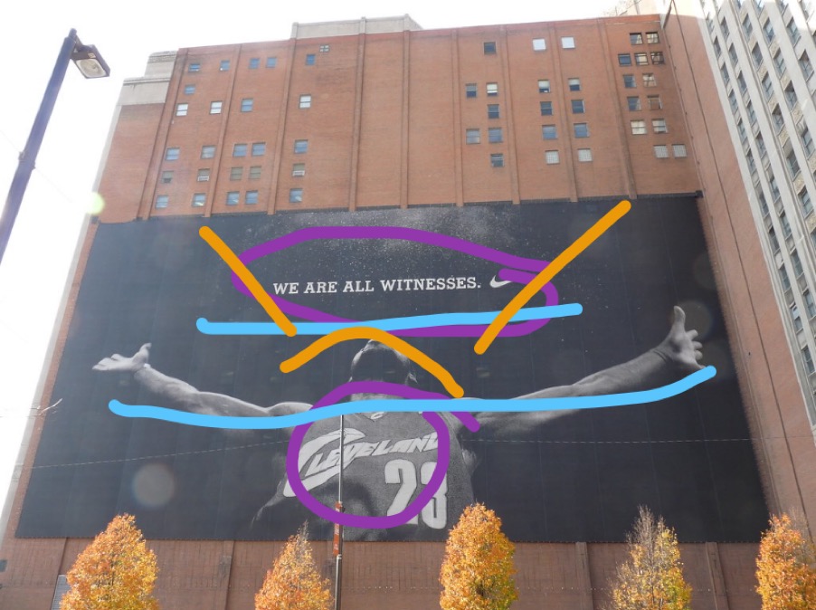
As you can see, I drew over the original to show the parts that I liked with the design. The contrast of the black and white really just brings your attention to the center.
I also love alignment of this ad. James has his arms stretched out wide, and the words are right above it. They really go together very nicely.
The last thing about the design that I love is how James looks up and the words are what he’s looking at. It makes my eyes look to where he is looking.
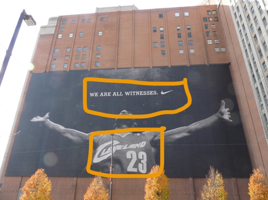
For this draw-over I wanted to point out the color. Black and white images are very unique in what message they share. In my mind, they represent history or something important being shared. Since black and white pictures were the only kind of pictures people could take in the beginning, it shows how we want to connect with history when we purposefully use black and white as a filter for our pictures today.
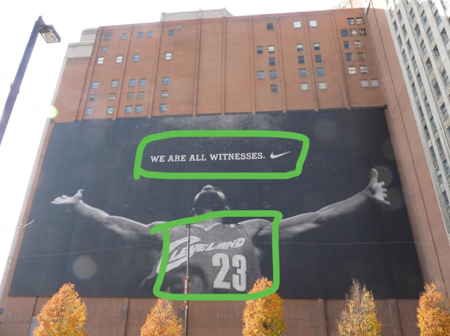
Finally for my last draw-over I wanted to talk about the typography. There are hardly any words on this ad, and that’s important. It says very little about what its even advertising, but since it has the Nike symbol and the jersey in the picture it makes us think a little longer about what the ad is trying to say. Its talking about how everyone gets to see how great Lebron James is in this moment, and we have to assume that he is wearing some kind of Nike merchandise. And Nike is wanting us to see that when we use their products, we can achieve greatness.

It’s very simple, it’s black and white, and there is just a shadow of a person. We don’t have a face to look at. And that’s what I was wanting. When I look at this, I think of what I can add to it from my own life. I think about that being me, and where I might be if I was standing like the outline of the girl is standing. I wanted to spark hope and imagination.
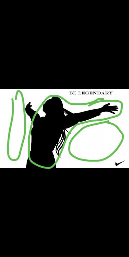
In my design, I made it the reverse of the original with the colors. The original was all black with white as the picture, so I switched it with white as the background and black as the picture. It gives it a good contrast and still matches the original ad design.
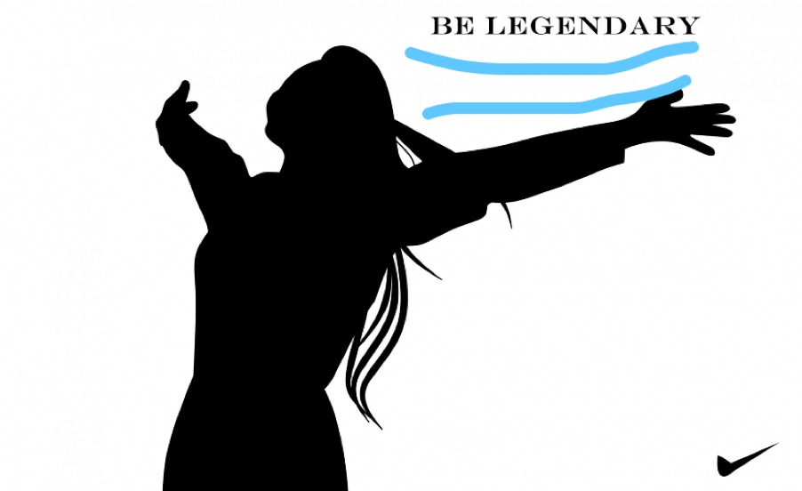
I also made the alignment for my design go together. The type is right in line with the arm of the girl, it directs your focus to those. There’s a lot of white space, so the black parts of the ad are what you look at first.
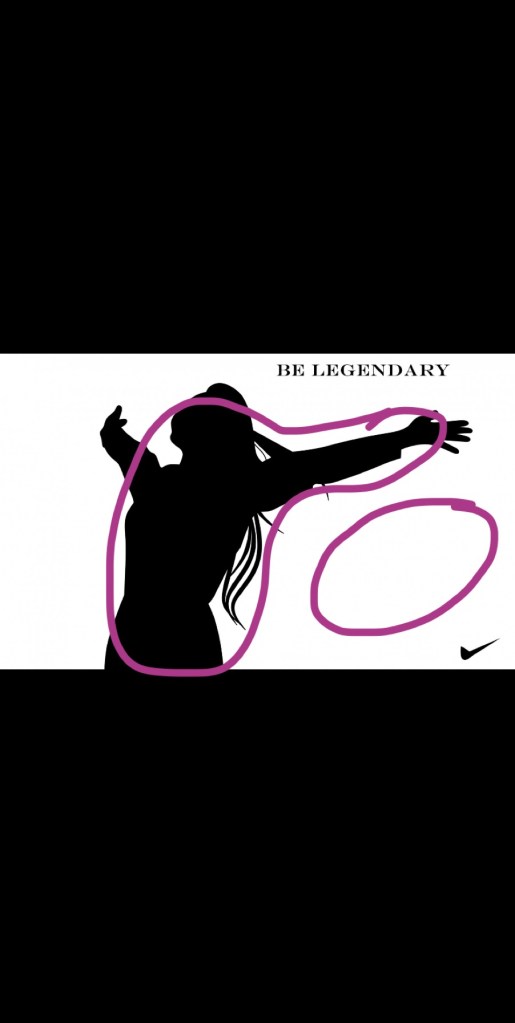
For this draw-over I focused on the color. There isn’t any color except for black and white, but as I mentioned with my original ad of Lebron James I like the black and white look. I think it gives us a chance to, in a way, connect with history.
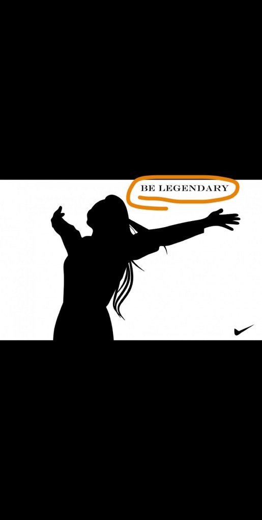
For my last draw-over I wanted to point out the typography I put in. Its small and simple, like the original ad. I used all capitol letters like the original ad, so I tried to match it.
In conclusion, I feel like my ad and the original ad go together very well. I feel like they both try to create the same message of working towards your dreams and think of what you can accomplish. They both are designed to inspire people.
Resume for Savannah Taylor
tay17010@byui.edu
Education
Currently enrolled at Brigham Young University- Idaho, Rexburg, ID
Working towards a Bachelors Degree of Communications, Emphasis in Public Relations
Work Experience
Cashier- All About Fuel & Food
2015-2018
Gift Wrapper/ Packer- Amazon Warehouse
2019-2020
Volunteer Experience
Missionary- The Church of Jesus Christ of Latter-day Saints
2018-2019 (18 month period)
Type One Diabetes Fundraising Events- JDRF (Juvenile Diabetes Research Foundation)
2003-Present
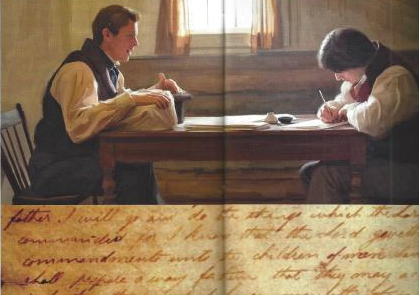
This picture was in a magazine article done by Eric Johnson. The original article can be found at https://www.mrm.org/paintings-book-of-mormon
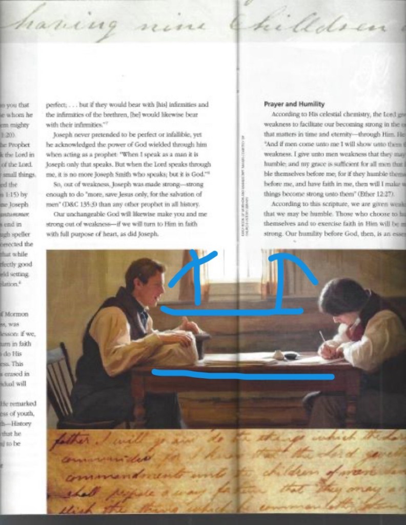
As you can see in this draw-over, the lines in the picture are leading lines. They draw our attention to the men, Joseph Smith and Oliver Cowdrey. The lighting also brings our eyes to their faces because they are lit up from the light in the window.

As you can see in this picture, I tried to point out how the fonts contrast each other. The top font is a light, cursive font. While the rest of the page is smaller type that is completely different.
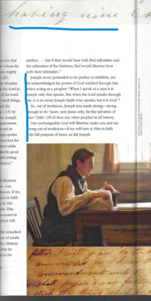
From this draw-over, I tried to point out the two types of font that are in this magazine article. The top, cursive font I would consider to be decorative because it looks fancy and done by hand. The rest of the page has regular type, and I would say it is sans-serif. You can see how the type has a little slant to it.
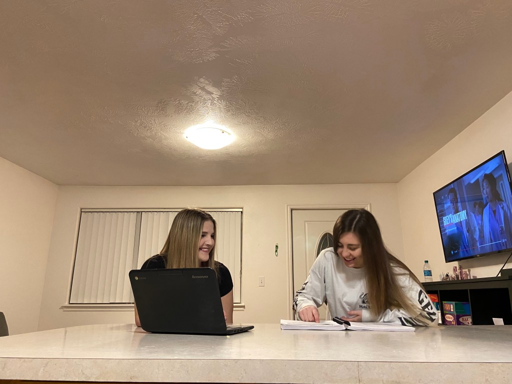
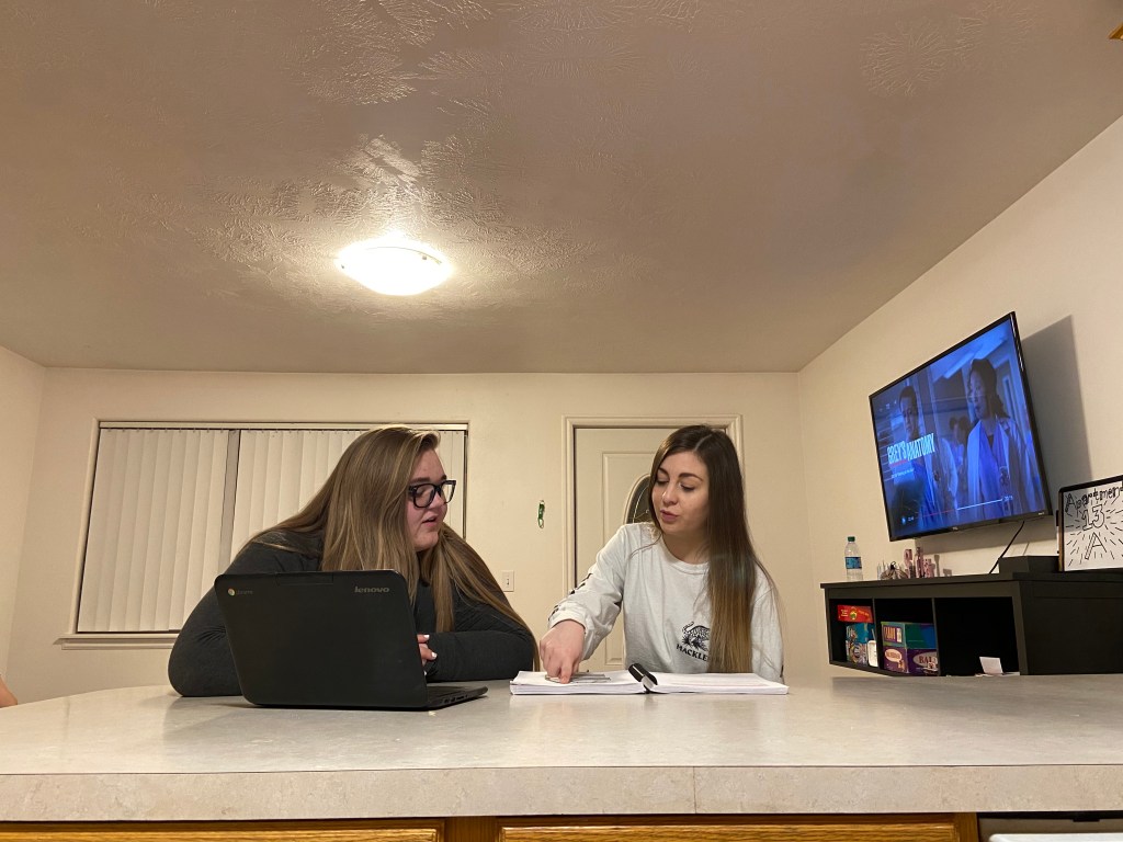
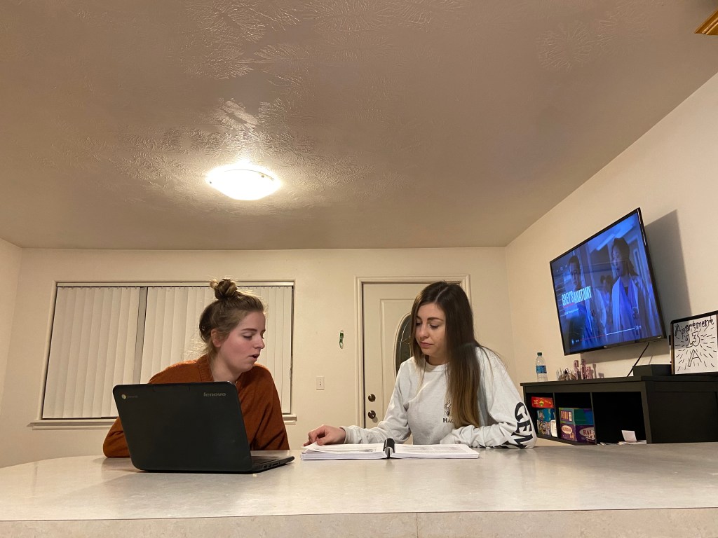
As you can see from these three pictures I took, they match the general idea of what the magazine picture is doing. The light is right above them, creating a triangle look. It makes your eyes go directly to the other points of the triangle. The table also creates a leading line, all of it draws your eyes to the girls in the pictures.
All of this is very important when it comes to design because you want the people who are looking at your work to clearly see what the point of the picture is, and they need to be able to easily read what you’ve typed. Which is why font is so important. Which font you use and where you put it makes a big difference in the overall layout of your design.

This 2012 advertisement by Delta Airlines was made to persuade people to fly with Delta in order to reach higher, to go even further. The link to this is http://deltapoints.boardingarea.com/wp-content/uploads/2012/04/delta-slogan.png
Contrast
In this picture advertising Delta, we can see a few different types of contrast. The one that catches our view first is the color. The dark blue and the bright red against the white and gray creates a big contrast, it draws our eyes first to the color because of the difference from the background.
Repetition
This picture is very simple, it mostly is just gray with a little color to it. The repetition is small, but still there. The blue words are located at three different spots on the picture, which shows that the color idea continues. The text is also the same throughout, and the Delta symbol is found twice.
Alignment
The way the Delta logo and slogan are located in the middle of the page directs our focus directly to them. The phrase “keep climbing” is put at just the right angle to point our eyes up, as if we were on an airplane.
Proximity
The logo for Delta and the phrase are put right next to each other, which makes us assume they are connected. Naturally that is what Delta was trying to do and it makes us connect the idea that to keep climbing and doing more can be put with Delta Airlines.
Color
There isn’t a lot of color here, but the color that we see is drastically different. The gray and white clouds give us a sense of uncertainty, or curiosity, to what might be “out there” in the world. The red for the symbol of Delta makes us instantly look to it, and the placement of the words next to it are what we see next. The blue gives us a calm feeling, making us think that by flying with Delta we can be calm about our experience.
Overall, this advertisement is simple and right to the point. I think it looks professional and has a pleasant design to it.
This is an example post, originally published as part of Blogging University. Enroll in one of our ten programs, and start your blog right.
You’re going to publish a post today. Don’t worry about how your blog looks. Don’t worry if you haven’t given it a name yet, or you’re feeling overwhelmed. Just click the “New Post” button, and tell us why you’re here.
Why do this?
The post can be short or long, a personal intro to your life or a bloggy mission statement, a manifesto for the future or a simple outline of your the types of things you hope to publish.
To help you get started, here are a few questions:
You’re not locked into any of this; one of the wonderful things about blogs is how they constantly evolve as we learn, grow, and interact with one another — but it’s good to know where and why you started, and articulating your goals may just give you a few other post ideas.
Can’t think how to get started? Just write the first thing that pops into your head. Anne Lamott, author of a book on writing we love, says that you need to give yourself permission to write a “crappy first draft”. Anne makes a great point — just start writing, and worry about editing it later.
When you’re ready to publish, give your post three to five tags that describe your blog’s focus — writing, photography, fiction, parenting, food, cars, movies, sports, whatever. These tags will help others who care about your topics find you in the Reader. Make sure one of the tags is “zerotohero,” so other new bloggers can find you, too.